Eight Major Failures of the Tropicana Redesign
I rarely play design critic. The fact is, I recognize that there's a subjective component to graphic design and I choose not to be bothered by the stuff that doesn't meet my personal expectations. There's a lot of quality brands out there with ugly logos, bad websites, and lackluster advertising. Personally, I figure if the brand is strong and the advertising works, who am I to criticize the finer points. Business is business, after all.
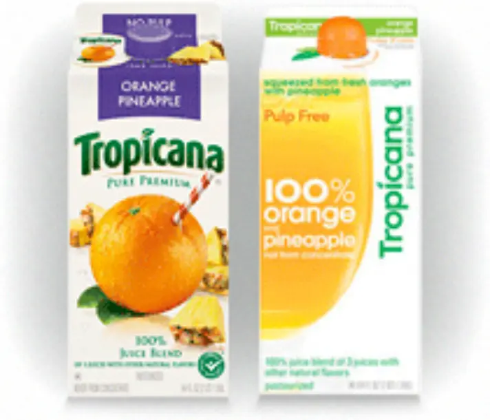
This, however, is not one of those times. As part of a corporation-wide packaging design overhaul by their parent company, PepsiCo, Tropicana's new juice containers recently hit the shelves and it's nothing short of a graphic design disaster. The new packaging was designed by Arnell Group (who, in my opinion, should be banished from NYC for this) and replaces the old packaging by Sterling Brands. Let's examine how they matchup head-to-head in eight different design-related categories.
Labeling
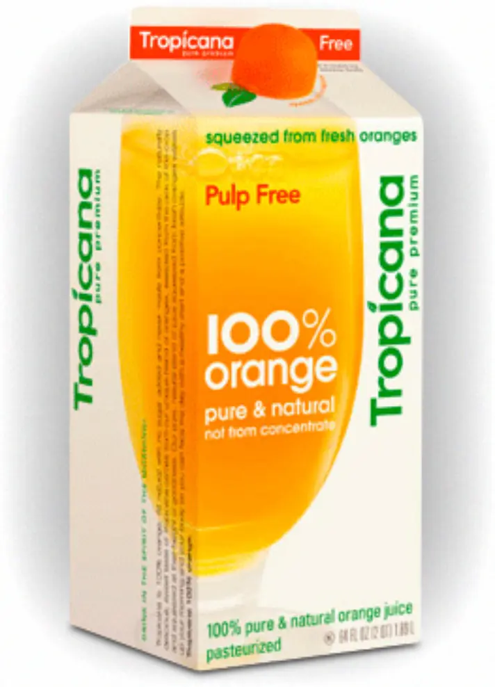
ORIGINAL: Text labeling appears along the top sealed edge and across the front, all knocked out of a large, tactfully positioned block of color indicating the type of juice. Product variations are easily distinguished at a glance.
REDESIGN: Text labeling of the juice type along the top and across the front is inconsistent – one is reversed and one positive – and the thin colored stripe is far less noticeable requiring a greater investment of time and concentration on the part of the shopper.
Information Structure
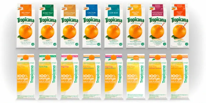
ORIGINAL: Packaging information is logically structured to make the shopper's selection as efficient as possible. Emphasis is placed first on brand, second on type, and third on supporting information:
- Tropicana
- No Pulp
- Pure Premium, 100% Pure and Natural Orange Juice
REDESIGN: Information structure is inconsiderate of the needs of the shopper. Primary emphasis is wasted on "100% orange" – information that is essentially useless to shoppers who are likely well aware they're looking at orange juice.
Tone of Voice
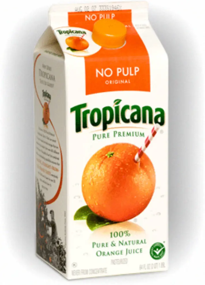
ORIGINAL: The product titles No Pulp, Some Pulp, and Lots of Pulp mirror human conversation. By using the same words people use around the house, the brand becomes friendlier, the product more familiar, and the information more comprehensible.
REDESIGN: "Hello, I am a robot. We have a multitude of pulp content levels for you to select from when determining the most appropriate orange-based beverage. Would you prefer High Pulp or Pulp Free?" At least they had the wherewithal not to go with Moderate Pulp, too.
Typography
ORIGINAL: The smooth bends and curvatures of the logotype indicate the natural nature of the product. Letter-spaced small caps are indicative of premium quality. Clean, capitalized sans-serifs are crisp and professional. Variations in font sizes are carefully selected and applied consistently.
REDESIGN: Logotype is cold and corporate, lacking any human touch or handcrafted quality. Avant Garde is used everywhere and without any apparent reason. Font weights and sizes are seemingly determined by a dart board. Garnished with a twist of lowercase letter-spacing.
Imagery
ORIGINAL: What can I say? It's practically famous. The web abounds with Photoshop tutorials on how to replicate the effects of this icon – the juiciest, orangiest orange the world has ever seen. Drink of Tropicana, my friends, through the glorious red and white straw of freshness and taste!
REDESIGN: Bad stock photo of Sunny D.
Color
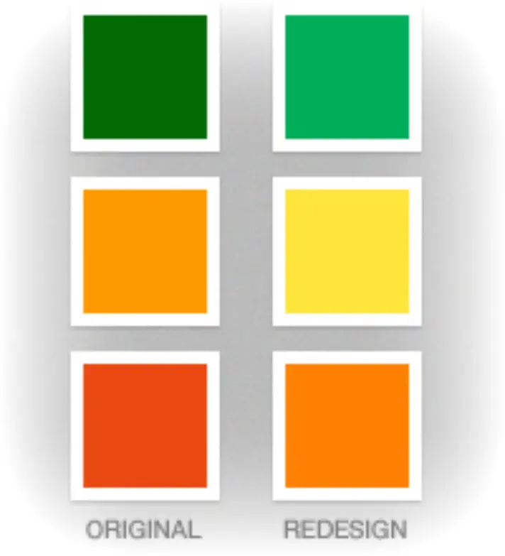
ORIGINAL: Deep, saturated oranges and rich greens inspire the appetite, evoke health, and are reminiscent of the natural world. The box itself looks edible.
REDESIGN: Brighter, more electric colors imply more energetic contents than the original. While the pros and cons of this switch are debatable, the yellow juice in the photograph is not. The juice's actual color might pop against a dark background, but it looks washed out and sickly against the overall white box.
Brand Speak
ORIGINAL: "Why Does Tropicana Taste So Good?" Dammit, I must know! [Reads paragraph. Forms relationship with brand.]
REDESIGN: "Drink In The Spirit of The Morning!" Fits with the energetic color scheme, but sounds like Corporate Ipsum (or ChatGPT, by today's standards). Set on the vertical, no less.
Affordances
ORIGINAL: You're looking for Orange Pineapple juice in a sea of cartons. If you've had it before you've already spotted the huge purple block from a distance. If not, the big juicy chunks of pineapple surrounding the orange are even more likely catch your eye. And if all else fails, the written labels certainly get the job done. This design is the pinnacle of user-friendly design.
REDESIGN: Same glass of yellow juice seen on all the other cartons – no help there. Thin lime green stripe reminiscent of, um, limes? No pictures of any actual fruit. Yikes. Your only hope is to catch the word "pineapple" somewhere on the box, but it's applied so inconsistently you couldn't possibly know where to look. Florida's Natural, anyone?
One final consideration: If you're ever involved in a redesign process and you come to the conclusion halfway through that you're going to need to dedicate your entire friggin' website to clarifying the situation you're creating (at the time of launch, Tropicana.com had a page dedicated to explaining the new design called How do you find Tropicana?), it's a pretty good indication that you just should cut your losses and start over at square one.
Years Later...
A few weeks after this article was written in 2009, Tropicana pulled the new design from the shelves and went back to the original. In the short time it existed, their orange juice sales dropped a whopping 20%. In 2011, Peter Arnell left the agency he founded amidst a lawsuit, and Arnell Group closed its doors in 2013.